Vivaz Joomla 5 Template
Vivaz is a clean, elegant and super flexible template for Joomla that includes light and dark modes out-of-the-box and it's perfect for any website.

See a live demo of the template with JReviews
Overview
With Vivaz you get a fast and easy to customize template that doesn't require an aerospace engineering degree to set it up. Vivaz uses Bootstrap scripts already available in Joomla, and only when needed. It is also privacy-focused so it doesn't load any scripts, stylesheets or fonts from remote sources.
Below you can find a summary of some the template's most important features:
- Compatible with Joomla 4 and Joomla 5
- Works with Joomla child template functionality
- Designed with Boostrap v5
- Light and dark modes
- 10+ brand colors that can also be used in themed sections
- RTL support
- Primary and secondary sidebars
- Lots and lots of module positions that can also be split into multiple columns and rows
- Customizable maximum width, and sidebar widths
- Themable sections with different background colors
- Background images for sections that can be assigned to specific menus
- Customizable mobile menu that can be shown in offcanvas and expand modes
- Flyout menus that can contain menu items, modules, and custom HTML.
- Easy to use Google Font sync to local feature
- Social media icons that can be easily extended to add any platform
Template Settings
The settings are broken down into different tabs. Below you can find a brief description for each tab.
-
General
Basic settings for logo, favicons, and copyright. You can also disable page zoom on mobile devices and configure whether the login form should be shown in the offline page.
-
Themes
Set theme mode (light or dark) and primary color, maximum width, and configure individual template section background colors and widths.
Make topbar sticky, enable scroll-to-top button and add module backdrops to sections that have background color or image.
-
Fonts
The template includes functionality to choose different Google fonts for headings and body text and the ability to download those fonts to be served locally for privacy purposes. You can use any available Google font.
-
Mobile Menu
Choose any number of menu modules to include in the mobile menu and set the breakpoint at which the menu should be shown.
-
Sidebars
Set fixed widths in pixels for primary and secondary sidebars and their visibility breakpoints. The secondary sidebar is always hidden below the breakpoint, while the primary sidebar can be set to hide or display below the main content.
-
Background Images
Assign images to topbar, header, bottom/top showcase and footer positions and optionally assign those images to specific menus. Image scroll can be set to parallax.
-
Social Media
Choose between topbar and footer positions, as well as start or end alignment, and add as many social platforms as you needed. The template includes SVG icons for 12 of the most popular platforms and includes instructions for adding your own icons right within the template settings.
-
Scripts
Add any custom scripts to the template header or footer. This is a great place to paste your analytics code.
-
CSS
Enable the template's custom.css file, where you can add your own CSS customizations, or add your customizations directly within the template's settings.
Sections & Module Positions
Below you can see a schematic of the template sections and the available positions within each section.
The logo can be shown on either the Topbar or Header sections and the template will automatically display the mobile menu toggle in the same section as the logo. Both Topbar the Header sections are considered to be the navigation sections, but only the Topbar can be made sticky so it's always visible at the top of the page.
Using the template's Theme settings it's possible to assign a different color theme to each section, which automatically adjusts the styles used within that section. Some sections, like the sidebars and component areas only allow allow setting a contrast color for the selected theme mode.
Usting the bootstrap column setting in modules, you can display several modules in the same position in multiple columns or rows.
In addition to the positions shown below, there are a error-page specific detailed in the Error Pages section below, and a couple of positions shown above and below the mobile menu:
- mobile-menu-top
- mobile-menu-bottom

Light and Dark Mode Switch
Enabling the light and dark mode switch allows any site visitor to quickly change the site from light to dark and vice-versa. However, it's important to consider that when using 3rd party extensions, unless these are designed only using Bootstrap v5 classes, they will most likely not be optimized to display at their best in both modes so in most cases you would use this feature only during development to see which mode works best for your site.
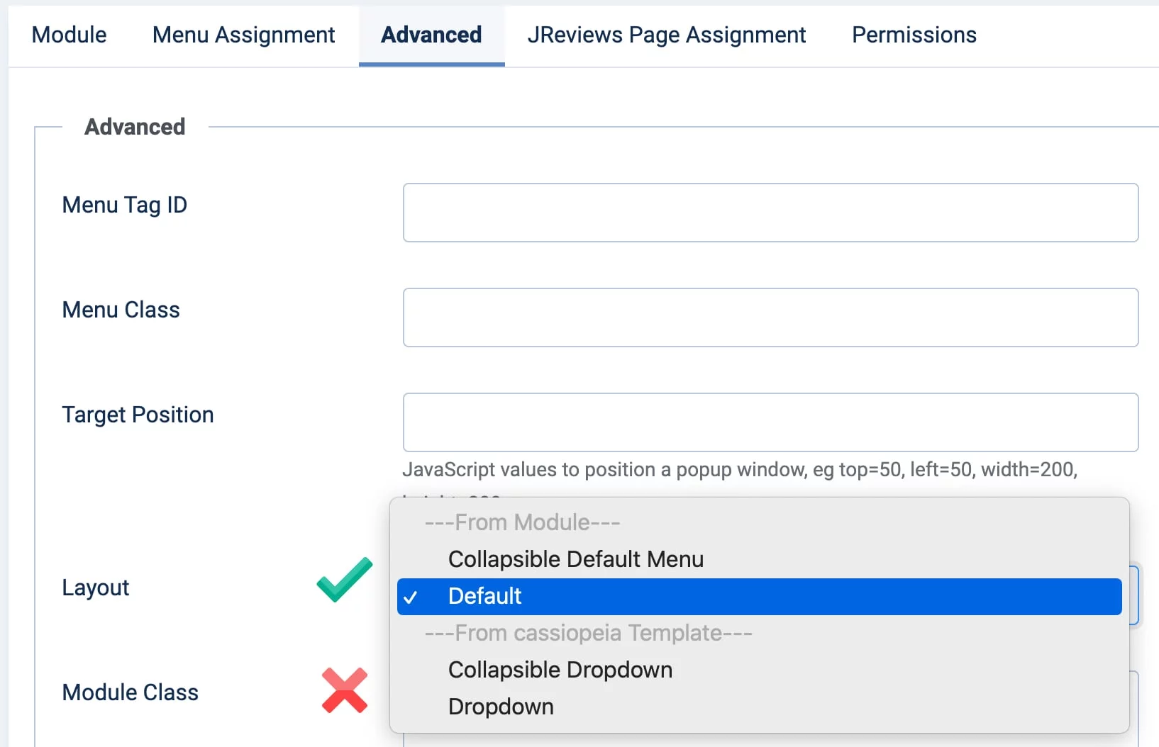
Module Menu Setup
When creating or updating menu modules for use with Vivaz, it is important that you only use the layout options available from the module itself and not from other templates. Typically you would use the Default layout. You can find more informatin about the Collapsable Default Menu in the next section.
Mobile Menu
The mobile menu consists of the menu toggle (hamburguer icon) and the actual menu links. You also have possibility of showing the menu as a slideout within the selected section (topbar or header) or offcanvas which appears from the left or right of the screen.
You can customize the breakpoint (screen width) at which the toggle is shown to the user, and also the menus which are shown as links in the mobile menu by choosing from existing published menu modules. Only first level menu links are shown in the mobile menu.
As mentioned in Sections & Module Positions above, there are two module positions available in the mobile menu:
- mobile-menu-top
- mobile-menu-bottom
Collapsible Menus
When setting up a menu module, it is possible to use the module's "Collapsible Default Menu" layout in the Advanced tab to collapse that particular menu in narrow screens. When collapsed the menu displays the hamburguer icon and expands on click. This is different from the mobile menu functionality which can group multiple menus into one and has a pre-determined location for display the menu toggle in the topbar or header navigation sections.
Menu Orientation
The Topbar and Header positions are considered the main navigation areas of the site and any menu module assigned to these positions is automatically displayed as a horizontal menu. If you want to convert other menus to horizontal you can use the horizontal-menu CSS class in the module's Advanced / Module Class setting.
Flyout Menus
Flyout menus can be assigned to Joomla menus of type heading which will display a dropdown to make the flyout visible on click. Flyout menu key features include:
- Multiple content blocks: menu items, modules, custom HTML, and separator.
- Adjustible content block grid columns.
- Themable blocks allows setting a different color scheme per block.
- Menu blocks allow setting number of grid columns used for sub-menus.
You can see an example of a flyout menu from our demo site below:

Login Module Flyout
A great use for a flyout menu is to place a login module within the flyout. You can get this working nicely by following these steps:
- Add a menu link of type
headingto your top navigation titled "Login" and make it visible to the "Guest" user group. - Add a menu link of type
logoutto your top navigation titled "Logout" and make it visible to the "Registered" user group. - In the Vivaz Flyout Menus tab, add a new flyout and assign it to the "Login" menu. Then add a new content block, select "Module", then select your login module. The module needs to be published and assigned to all pages, but it's not necessary to assign it to a module position..

Module Backdrop
Enabling the module backdrop feature in the Theme tab settings will automatically add the backdrop to all modules within sections that have a background color or a background image. The backdrop makes the module content popup and more readable. You can see an example of what the backdrop looks like in the image below where the darker color represents the area where the module would be rendered.

You can manually add or remove the backdrop in modules using the backdrop and no-backdrop CSS classes in the module's Advanced / Module Class setting.
Error Pages
Error pages use the error.php template file where only a few select module positions are shown to retain the site's main navigation features. These are:
- above-fold
- topbar
- topbar-end
- header
- header-end
In addition to these, there are error specific module positions.
- A generic position that can be shown on all error pages called
error-generic. - A dynamic status-code-specific module position, that even though not defined in the template itself, can be added directly in the Joomla module position setting when creating a module. The format is
error-code-[STATUS_CODE].
For example, to show a module only in 404 pages, use the position name error-code-404.
This gives you plenty of flexibility when customizing your error pages by using module positions, rathen than having to directly modify the error.php template file.
Hooks
Vivaz comes with its own hooks system to allow making some customizations without having to modify any core files. Using the new Joomla 4 child template functionality, you can create a functions.php file without the child template and write your hooks there. We'll be adding more hooks overtime as needed.
showcase:background_image_css{.module_position}
This hooks allows you to modify the CSS class that's constructed for the showcase positions when using background images. One possible usage is to add a gradient to the background image. You can modify andy of the CSS properties passed in the $css array. The $bgImage array contains all the template settings for the background image which can be used to write additional logic as needed.
// This example adds a gradient to all background images regardless of module position

Clickfwd\Vivaz\Vivaz::filter('showcase:background_image_css', function ($css, $bgImage) {
    $css['background-image'] = 'linear-gradient(to right, rgba(0, 0, 0, 0.4), rgba(0, 0, 0, 0.4)), '. $css['background-image'];

    return $css;
});

// This example adds a gradient to the showcase-top background image

Clickfwd\Vivaz\Vivaz::filter('showcase:background_image_css.showcase-top', function ($css, $bgImage) {
    $css['background-image'] = 'linear-gradient(to right, rgba(0, 0, 0, 0.4), rgba(0, 0, 0, 0.4)), '. $css['background-image'];

    return $css;
});