Search & Filters
Make your site's content searchable and discoverable! There are many tools in the JReviews search arsenal. Whether it's a simple keyword search, an advanced search form or faceted search with instant updates, JReviews has it all.
Getting Started
Before you begin exploring all the different search options, it's important to create the search menu. It turns out, that this menu is also the Advanced Search Page mentioned below.
The Initial Setup covers how to create menus in Joomla and WordPress and includes a short video.
Search Options Overview
Below you can find a brief summary of the different search options available in JReviews:
Available Search Options
- Simple Search Listings - Basic keyword search for listings
- Simple Search Reviews - Basic keyword search for reviews
- Advanced Search Page - Comprehensive search form with multiple filters
- Advanced Search Module - Search module/widget for sidebar placement
- Advanced Filtering Module - Dynamic filtering with instant results
- Click2Search - Turn custom field values into searchable links
Simple Search
Simple Search for Listings
Simple search is available out of the box in the directory and category pages. Simple search is scoped to listing title, summary, description, meta keywords and custom fields. You can modify some aspects of the functionality related to simple search.

Hiding Simple Search
You can hide the simple search throughout the site so visitors don't see the input in directory and category pages.
Configuration → Search → Simple Search → Show search box in list and directory pages
Changing the Query Type
By default, simple search finds results that contain all words typed in the search input, but only within a specific field.
For example, let's say you have the following text in a listing:
Summary: red roses Description: yellow sunflowers
Searching for yellow roses with the All query type will not find this listing because the words are not within the same field. They are not used within the same context. However, searching for roses and red roses will find the listing.
If you prefer to have results found for any typed word, then you can change the query type to Any. While this may work under some scenarios, keep in mind that it will make it more difficult to narrow down results based on keywords, as any listing containing at least one of the words will be shown in the results.
Configuration → Search → Simple Search → Default query type
Automatically Filtering by Category
There's a couple of ways to do this:
-
Configuration → Search → Simple Search → Use current page category id as filters for simple search
By enabling this setting, when a keyword search is performed in category pages, the category ID will be automatically included as a search filter.
-
Configuration → Search → General → Use current page Itemid for search results
Another approach is through menu IDs. By using the category URL as the anchor to display the results, the category ID is also automatically included as a filter, passed through the menu ID without the need to explicitly show the category parameter.
Try them both and see which one you prefer.
Searching within Custom Fields
The ability to search within custom fields is built right into simple search. To fine-tune the quality of results, you can specifically include and exclude fields from search in the Fields Manager by toggling the search column for individual custom field.
Simple Search for Reviews
Simple search for reviews works similarly to listings search, but focuses on review content including titles, descriptions, and custom review fields.
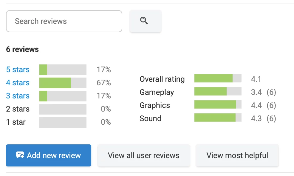
Advanced Search Page
Creating the advanced search page is a required step for all JReviews sites, because this page's URL is used to anchor all search result pages. The initial setup page has a section on creating menus that also includes a short video showing how to create the Advanced Search page.
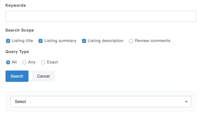
In addition to having a generic Advanced Search page, you can create more copies of this page with specific listing types pre-selected in the menu settings. This will automatically load the custom fields for the listing type on the page without requiring the user to first select a listing type.
The advanced search page is supposed to be plug-and-play, so it doesn't offer many customization options, other than the ability of choosing which custom fields to show in the form.
For customizable search forms, you can use the advanced search and advanced filtering Joomla modules and WordPress widgets.
Displaying Custom Fields
When a custom field is created, it is automatically enabled for search and shown in the advanced search page. You can exclude fields from search, and hide them from the form, by toggling the search column for individual custom fields in the Fields Manager.
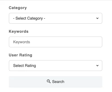
Advanced Search Module
The Joomla module and WordPress widget for advanced search are pre-installed with JReviews and available out-of-the box.
Joomla: In the Joomla manager, search for the JReviews Advanced Module by filtering the modules by module type. If you don't find any existing instances of the module, you can click New and look for JReviews Advanced Search Module to create a new instance.
WordPress: In WordPress you can find the widget available in the Widgets page and drag it to an existing widget position on the right side to view the settings.
Simple Search Live Results
A nice feature of the advanced search module and widget, that makes it useful even when used for simple search, is the live result functionality that can show users a preview of the search results, without having to click to search or navigate to a different page.
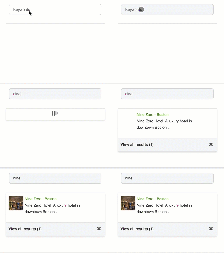
You can easily create a simple search with live results using the module/widget settings:
- Disable all the default fields under MAIN SETUP
- Enable
Live Searchunder USABILITY & USER INTERFACE - Enable
Module Theme(Joomla) /Widget Theme(WordPress) under THEME CUSTOMIZATION in the Advanced Search Module/Widget, and add the following HTML code to show only the keywords input:
<div class="jrFieldDiv">
   {keywords}
</div>
Alternatively, if you want to use the existing simple search layout without enabling the Module Theme (Joomla), Widget Theme (WordPress) setting, you can fill out the Theme Suffix setting using _simple.
Available settings allow you to make simple changes to the live results presentation, like setting the number of results shown, changing the number of columns, and toggling the thumbnail and summary. You can also use the category, directory and listing type filters to limit the search results to listings within the given constraints.
Default Search Fields
In addition to keywords, you can include category and rating fields in search with just a few changes.
To setup the advanced search:
- Enable Keywords, Category and Rating fields under MAIN SETUP
- Make sure you have
Module Theme(Joomla),Widget Theme(WordPress) disabled under THEME CUSTOMIZATION in the Advanced Search Module/Widget.
Changing the Layout of Default Search Fields
To change the display order or customize the layout of default fields, enable the Module Theme (Joomla), Widget Theme (WordPress) setting under THEME CUSTOMIZATION, and use the following HTML code as a starting point:
<div class="jrFieldDiv">
  <label>{category_label}</label>
  {category}
</div>

<div class="jrFieldDiv">
  <label>{keywords_label}</label>
   {keywords}
</div>

<div class="jrFieldDiv">
  <label>{user_rating_label}</label>
  {user_rating}
</div>

<div class="jrFieldDiv">
  <label>{editor_rating_label}</label>
  {editor_rating}
</div>

<div class="jrFieldDiv">
   <button class="jr-search jrButton">
      <span class="jrIconSearch"></span><span>Search</span>
   </button>
</div>
The {xyz_label} tags above automatically replace the static language string in JReviews. If you prefer to use your own text, or completely remove the labels, don't use the label tags.
Custom Fields
The approach for including custom fields in the form is similar to the one above for customizing the display layout of default fields. You can add any custom field using the {jr_fieldname} syntax.
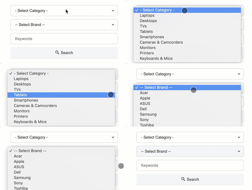
It's important to wrap custom fields in a <div class="jrFieldDiv"> tag because the jrFieldDiv CSS class is used to sprinkle some javascript functionality into the form and allows loading the necessary field options and connecting related fields.
For a products website where you have brands and want to allow users to search by category, brand and keywords, you can use this HTML code in the Module Theme under THEME CUSTOMIZATION:
<div class="sm:fwd-flex fwd-items-center fwd-justify-center">
  <div class="jrFieldDiv fwd-mx-1 fwd-my-2">
    {category}
  </div>

  <div class="jrFieldDiv fwd-mx-1 fwd-my-2">
    {jr_brand}
  </div>

  <div class="jrFieldDiv fwd-mx-1 fwd-my-2">
    {keywords}
  </div>

  <div class="jrFieldDiv fwd-mx-1 fwd-my-2">
     <button class="jr-search jrButton fwd-w-full sm:fwd-w-auto fwd-flex fwd-justify-center">
        <span class="jrIconSearch"></span><span>Search</span>
     </button>
  </div>
</div>
Advanced Features
Basic Filters & Auto Detect
When showing the category list, you can also limit the categories which appear in the list by changing the options under BASIC FILTERS. The basic filters for directories, listing types and categories allow you to limit the results to the selected options without the need for displaying those lists to the end user in the search form.
When using the Auto Detect feature, the form will try to find the context of the page in which it's shown, and automatic filter the results based on that context. For example, if the form is in a directory page, the results will be limited to listings in that directory. If it's in a category page, the results will be limited to listings in that category.
Related Field Options
When you include fields with related field options, the module will automatically toggle the display of field and load the corresponding field options.

Search by Author
Use the HTML code below in the Module Theme to allow users to search by listing owner. You also need to allow search by listing owner in Configuration → Search Allow searching by listing owner.
<div class="jrFieldDiv">
    <label for="author">Author</label>
    <input type="text" id="author" name="data[author]" class="jrText" value=""/>
</div>
Custom Results Ordering
When using the Module Theme to customize the form, it's possible to set a different ordering for the search results using hidden inputs or select dropdowns.
Rating Criteria Filtering
Using the Module Theme setting you can also add select lists to let users filter results by rating and individual rating criteria.
Advanced Filtering Module
Advanced Filtering is a great looking and powerful faceted filtering solution for your site with instant page updates and a mobile slideout panel.
Overview
To implement advanced filtering you will be using the provided Joomla modules and WordPress widgets:
- JReviews Listings Advanced Filtering
- JReviews Reviews Advanced Filtering
These include settings for:
- Standard filters - categories, listing types, user & editor ratings
- Theme customizations - allows adding custom fields filters through shortcode tags
- Mobile view settings for slideout panel
- Live updates - to show results without reloads on same page
For a better user experience with the filtering module we also recommend enabling Ajax Pagination in the Configuration → Theme & Navigation tab.
Getting Started
-
Publish to an existing position
Find the module or widget you want to setup (listings filtering or reviews filtering) and publish it to an existing position.
The only custom template positions where filters can be published when live updates enabled are
jr-review-filtersandjr-listpage-below-pagetitle. Use the first one for review filtering in the listing detail pages. The second one shows in list pages and can be used for listings filtering. You can also use any Joomla template position or WordPress theme widget position that's available to you. -
Adjust basic display and filter settings
Toggle the standard filters you'd like to use, and make other basic display changes. We recommend making the least amount of changes when first trying this out. You can always fine-tune them later.
-
Add custom field filters
The easiest way to start using the filter shortcode tags is through the
THEME CUSTOMIZATIONsetting. ToggleEnable Module Themeto enable it, then use the textarea below it to add the filter shortcodes.You can choose one of your custom fields and use the most basic shortcode format:
[filter name="jr_state"] -
Menu & page assignment
Create a JReviews Advanced Search menu if you don't already have one. When someone first uses Advanced Filtering they will be taken to the advanced results page and this is the only way to ensure that users can continue using the filters there.
In Joomla, the module assignment needs to include this page.
This should give working filters in the front-end and a taste of what you can do with them. There's a lot more, so do continue reading the next sections and learn about using shortcode attributes to get the most of your filters.
Standard Fields
Standard filter fields that can be quickly toggled via settings include:
- Categories
- Listing Types
- Keywords
- User Rating
- Editor Rating
If you need to show standard fields in a specific order, or want to use the available attributes to customize the display options, you can disable them, and use the shortcode syntax:
[filter name="categories" label="Categories" display_as="link" split_list="0"]
[filter name="listing_types" label="Listing Types" display_as="link" split_list="1"]
[filter name="keywords" label="Keywords"]
[filter name="rating" type="user" label="User Rating"]
[filter name="rating" type="editor" label="Editor Rating"]
Custom Fields
Create filters for custom fields by adding the custom field name to the name attribute:
[filter name="jr_state"]
Shortcode attributes allow you to customize the label and other display options:
[filter name="jr_state" label="State" display_as="link" show_all="1" option_search="1"]
Author Field
To include a listing author filter use author for the name attribute. For this filter to work, listing owner searches must also be enabled in Configuration → Search → Allow searching by listing owner setting:
[filter name="author" label="Author"]
Basic Filters & Autodetect
Different combinations of settings will result in slightly different behavior of the filters:
-
Auto-detect enabled
Auto-detect filters results based on the current page and this works well in category and detail pages. For directory pages it would filter by directory initially.
When enabling auto-detect, disable the category and listing type filters.
-
Auto-detect disabled, basic filters used, category and listing type lists hidden
The basic filters are added as hidden inputs. They are checked in this order: category, listing type, directory and only the first one that is not empty is used for filtering.
-
Auto-detect disabled, basic filters used, category or listing type lists shown
Automatically limits options shown in the category and listing type lists based on the selected values in basic filters.
-
To limit category list options, use the directory and category filters
-
To limit listing type list options, use the listing type filter
It's difficult to limit categories based on listing type because there can be many top level categories without a listing type.
-
Category and listing type filters should not be used together because selecting a listing type will not change the values of the category list.
Shortcode Attributes
| Attribute | Description | Values | Default value |
|---|---|---|---|
| name | Name of the custom field - required attribute | i.e. jr_address | |
| label | Title of the filter. Set to 0 to hide the label | 0, text | The custom field title |
| placeholder | Placeholder text, used only for text inputs | any custom text | |
| display_as | How the field will be displayed | checkbox, select, link or linkboxed | checkbox |
| auto_open | Automatically toggles open the filter on page load to display the input or search options | 0 or 1 | 0 |
| show_cat | The filter will be displayed only if specified categories are detected | Comma separated list of category IDs | |
| show_dir | The filter will be displayed only if specified directories are detected | Comma separated list of directory IDs | |
| show_listing_type | The filter will be displayed only if specified listing types are detected | Comma separated list of listing type IDs | |
| hide_cat | The filter will be hidden when the specified categories are detected | Comma separated list of category IDs | |
| hide_dir | The filter will be hidden when the specified directories are detected | Comma separated list of directory IDs | |
| hide_listing_type | The filter will be hidden when the specified listing types are detected | Comma separated list of listing type IDs | |
| match_type | Specifies the default query type for multiple select and checkbox custom fields | all, any | all |
| match_switch | Enables the toggle switch for the match type for multiple select and checkbox custom fields | 0 or 1 | 1 |
| split_list | Selected filter options are moved to the top of the list | 0 or 1 | 1 |
| split_option_limit | The split_list feature will only become active if the number of options for the field is higher than the specified limit | integer | 10 |
| show_all | Limits the number of options shown in a checkbox or link list with a 'Show all' link at the bottom to expand the list | 0 or 1 | 0 |
| show_limit | Sets the number of options shown when the show_all attribute is enabled | integer | 5 |
| option_dialog | When clicking the 'show all' link additional options are shown in a dialog, instead of inline | 0 or 1 | 1 |
| option_search | Enables a search input within the individual checkbox, link, category, listing type filter | 0 or 1 | 0 |
| width | Allows specifying a fixed width in pixels for an input in horizontal filtering | integer | na |
| preview | Shows a preview of the selected options below the filter title, even when the filter is closed | 0 or 1 | 1 |
| slideout | Enables the slide effect for the filter when the label is clicked | 0 or 1 | 1 |
| reset | Adds a 'clear' link above the filter input to allow for quickly resetting all selected values for that filter | 0 or 1 | 0 |
| radius_min | Minimum radius for proximity filter. Only works on the proximity search field | integer | 10 |
| radius_max | Maximum radius for proximity filter. Only works on the proximity search field | integer | 50 |
| radius_step | Radius step for proximity filter slider. Only works on the proximity search field | integer | 10 |
| radius_default | Default radius for proximity filter. Only works on the proximity search field | integer | 10 |
Grouping Shortcodes
A filtergroup shortcode can be used to group individual filters. This is convenience method that allows applying conditional display attributes so it's not necessary to do it for each field. For example, it's possible to group together all restaurant filters and use the show_listing_type attribute to show them only when a restaurant listing type is detected:
[filtergroup name="Restaurants" show_listing_type="3"]
	[filter name="jr_cuisine" label="Cuisine" display_as="checkbox"]
	[filter name="jr_mealsserved" label="Meals Served"]
	[filter name="jr_restaurantpricerange" label="Price Range" display_as="linkboxed"]
[/filtergroup]
Reset Filter Values
Enable the Clear all link setting if you want to provide a quick way to reset all filter selections. You can also add the feature to the theme using the reset shortcode:
[reset]
To customize the text, use the label attribute. It's also possible to convert the link to a button with the display_as attribute:
[reset label="Clear filter values" display_as="button"]
If you have a category or listing type list in the form these will not be cleared because they are necessary to maintain the context for the site visitor.
Mobile Slideout Panel
In mobile devices the filters output is hidden and a Filters button is shown in the list page header to trigger a slideout panel with the filters.
Use the settings to choose when to convert the regular output into the slideout panel:
-
Convert to mobile view
Select the breakpoint when to convert the module to slideout panel
-
Module container class
Specify the CSS class used by the module container so it can be hidden in mobile view. In other words, when the screen meets the mobile size requirements, we want to hide the module and to do that we need to know the class of the parent container for that module. For example, on our iReview template the module HTML markup looks like this:
<div class="moduleid-192 mod-container clearfix">
    <div class="mod-inner ">
        <h3 class="mod-title">Advanced Filtering</h3>
            <div class="mod-content"><div class="jr-page jrPage jr-filters-module jrFiltersModule jrForm">
So we use the
mod-containerclass by default. -
Module title class
Specify the CSS class used by the module title so it can be shown in the slideout panel. Similar to the previous setting, we use this setting to copy the module title to the mobile filtering panel. In our iReview template the module title class is
mod-titleso we use that as the default.
Vertical & Horizontal Layouts
It's possible to change the layout of filters from vertical to horizontal via settings. The vertical layout is most useful when showing the filters in a sidebar.
Range Slider Add-on
The Range Slider Add-on converts numeric custom field inputs into a slider interface in advanced filter forms. It allows setting up any number of fields with different display options.
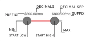
It's a free add-on that can be installed directly through the JReviews App Store.
Limitations
Custom fields inside a controlled field group cannot be used as filters. For example, if you have a field group in the field groups manager that is controlled by one or more field options, any custom fields inside that field group cannot be used as Filters.
Example Template
Below is an extended example you can use as reference. We are using a version of this on our demo site. Using filter groups and using display conditionals show_dir and show_listing_type allows having using a single module/widget throughout the site with dynamic output that changes the filters shown depending on the page in which it's being displayed.
<!-- Places -->

[filter label="Proximity search" name="jr_address" placeholder="City, address, postal code" show_dir="2,10" radius_min="10" radius_max="100" radius_step="5" radius_default="30"]

[filter name="jr_state" label="" display_as="checkbox" show_dir="2,10"]

[filter name="jr_city" label="City" display_as="checkbox" show_dir="2,10"]

<!-- Businesses -->

[filter name="jr_services" label="" show_listing_type="1" show_cat="91"]

<!-- Hotels -->

[filtergroup name="Hotels" show_listing_type="2"]
	[filter name="jr_hotelamenities" display_as="checkbox"]
	[filter name="jr_hotelpricerange" display_as="linkboxed"]
[/filtergroup]

<!-- Restaurants -->

[filtergroup name="Restaurants" show_listing_type="3"]
	[filter name="jr_cuisine" label="Cuisine" display_as="checkbox"]
	[filter name="jr_mealsserved" label=""]
	[filter name="jr_restaurantpricerange" label=""]
[/filtergroup]

<!-- Bars -->

[filtergroup name="Bars" show_listing_type="4"]
	[filter name="jr_drinkoffering" label=""]
	[filter name="jr_barmusic" label=""]
	[filter name="jr_outdoorseating" label="Outdoor Seating"]
[/filtergroup]

<!-- Products -->

[filtergroup name="Products" show_listing_type="8" show_dir="3"]
	[filter name="jr_productprice" label="Price"]
	[filter name="jr_brand" label="Brand" display_as="checkbox"]
[/filtergroup]

<!-- Movies -->

[filtergroup name="Movies" show_dir="5"]
	[filter name="jr_directedby" label="Director"]
	[filter name="jr_writtenby" label="Writer"]
	[filter name="jr_actors" label="Actors"]
	[filter name="jr_year" label="Year"]
	[filter name="jr_mpaarating" label="MPAA Rating" display_as="linkboxed"]
[/filtergroup]

<!-- Games -->

[filtergroup name="Games" show_dir="6"]
	[filter name="jr_publishedby" label="Publisher"]
	[filter name="jr_gamegenre" label="Genre"]
	[filter name="jr_gamereleasedate" label="Release Year"]
[/filtergroup]

<!-- Real Estate -->

[filtergroup name="Real Estate" show_listing_type="13" show_cat="61"]
	[filter name="jr_realestateprice"]
	[filter name="jr_rooms"]
	[filter name="jr_bathrooms"]
[/filtergroup]

<!-- Events -->

[filtergroup name="Events" show_dir="10"]
	[filter name="jr_venue" placeholder="Venue name"]
	[filter name="jr_eventdate"]
[/filtergroup]

<!-- Cars -->

[filtergroup name="Cars" show_listing_type="14" show_cat="65"]
	[filter name="jr_carprice"]
	[filter name="jr_carmake"]
	[filter name="jr_carmodel"]
	[filter name="jr_caryear"]
[/filtergroup]

<!-- Recipes -->

[filtergroup name="Recipes" show_dir="12"]
	[filter name="jr_recipetags"]
	[filter name="jr_servings"]
	[filter name="jr_totaltime"]
[/filtergroup]

<!-- Software -->

[filtergroup name="Software" show_dir="8"]
	[filter name="jr_developer"]
	[filter name="jr_os"]
[/filtergroup]
Customizations
If template customizations is your thing, then shortcode tags can also be added directly to the module/widget template file. Just copy the module/widget template to your custom theme, and consider using a theme suffix if you want to have different filtering forms.
Joomla
templates/
`-- jreviews_overrides/
    `-- views/
        `-- themes/
            `-- mysite/
                `-- modules
                    `-- filters.thtml
WordPress
jreviews_overrides/
`-- views/
    `-- themes/
        `-- mysite/
            `-- modules
                `-- filters.thtml
For the review filters, use reviews_filters.thtml instead of filters.thtml which is used for listings filters.
Fields Module
Overview
Similar to Click2Search, but outside of listings, you can use the Field Joomla module and WordPress widget to generate quick listing search and navigation links for field options.
For example, this can be useful for restaurants to show a list of cuisines in the sidebar to let users click one to filter the results. In the case of movies, users can click on genre or MPA rating for filter the results.
The main difference between the other search options mentioned above and this one is that the fields module/widget only allows filtering results for a single custom field option. This allows:
- Using field option pages as landing pages for SEO
- Using field options as virtual categories
Getting Started with Fields Module
-
Publish the Module/Widget
Find the Fields Module in Joomla or the Fields Widget in WordPress and assign it to the position of your choice and publish it.
-
Set the custom field name
Fill out the
Field namesetting with the name of the field for which you want to display the field option links -
Adjust the settings
- Display Mode - links vertical, tag, tag cloud, dropdown list
- Option Listing Count
- Option Images
- Option Ordering - alphabetical, listing count, pre-defined ordering
-
Enable search in the fields manager
In the fields manager check that the field is enabled for search. This is the toggle under the search icon header in the list of fields.
With this you have a basic setup, enough to show the options on the site in the published position. The system will try to use the context of the page to automatically show the field options that are in use and will lead to results when clicked.
Filtering Mode
The filtering mode setting can be used to automatically change the generated links to filter the results. The available modes are:
-
Current Page Category
Adds the category filter to the results and uses the current category as the base URL for option links and a
-
Current Page Listing Type
Adds the listing type filter to the results. If an advanced search menu exists for this listing type, it's URL will be used as the base URL. Otherwise, the main advanced search menu is used.
-
No Filtering (Using Adv. Search Menu)
Default mode which generates links based on the advanced search menu URL structure.
-
No Filtering (Using Hardcoded Menu ID)
Allows using a menu ID in Joomla, or a page ID in WordPress, as long as they are JReviews pages. For example, if there is a City Guide directory with a menu/page ID of 333, you select this mode and fill out the ID below it. The option links will then use the URL for this menu as the base URL
Drill Down Mode
This is how you take advantage of field option relations with a single module/widget for navigation purposes. You click on a field option link, and the output automatically changes to load the dependent field options from another field.
The most popular use-case for this is location navigation using State and City fields. You click on California, the page reloads to show the listings in California, and at the same time the output of the module/widget changes to load the cities options in the City field for California.
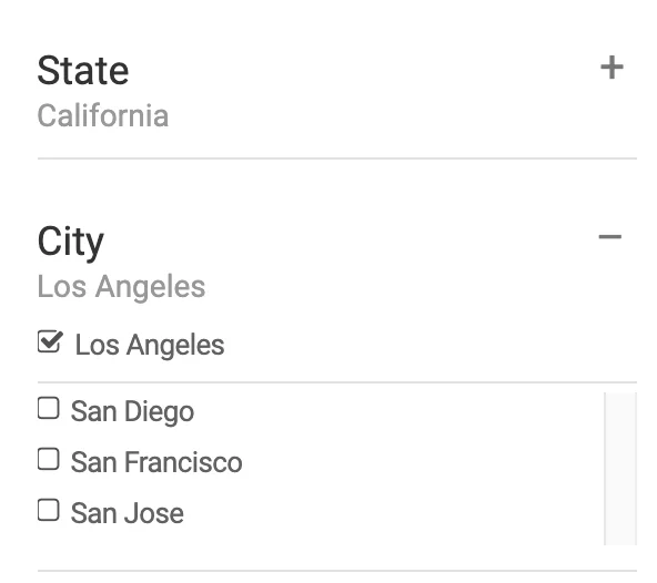
To use the feature, just enable Drill Down Mode and make sure that the module/widget is visible on the result page. In Joomla, if the results page uses default filtering mode (ADv. Search Menu), the module needs to be published to that menu.
There's a few other settings here:
-
Click2search Drill Down Fields (optional)
Comma list of dependent field names that will trigger the drill down mode in click2search URLs. This is required when placing multiple drill down field modules on the same page.
-
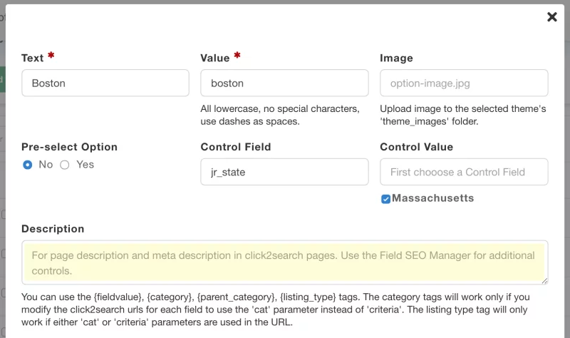
Control Field and & Control Value (optional)
Use to display a subset of options for a field. For example, with the
StateandCitysetup, if you only want to show cities inCalifornia, you would usejr_cityas the field name in the Main Setup. Then use these settings to set the control field asjr_stateand the control value ascalifornia.These settings force the drilldown behavior in non-click2search pages. Otherwise, using the
jr_cityfield would show all fields in all states.
Custom URL Parameters
If you need a bit more control over the filtered results when an option is clicked, you can use this setting which allows adding custom url parameters to the generated field option URLs.
Custom Ordering
One use-case for this is to change the ordering for the results to use a custom order. For example, if you are showing a list of brands, you can include ordering based on product prices:
order=jr_productprice
You can also use any of the default ordering options to show results by most recent, top rated, etc. You can perform a standard search and then re-order use the ordering list to see the different order values in the URL that you can use for custom params.
Extra Filters
To add extra filtering parameters to the generated links, include the parameters as you see them in search URLs. Check the custom params page for ideas.
To include filters for other custom fields:
jr_fieldname=value
If add additional fitlering parameters, you should hide the listing count because the count will only reflect results for the the main field settings, not the custom parameters.
Custom Theme Suffix
To force the search results output template to load with a specific theme suffix, you can also pass it as a parameter:
tmpl_suffix=_suffix1
Click2Search
Enabled with the flick of a switch in a custom field's settings, this feature converts field output to a link in listings and reviews, allowing users to quickly find, with a click, other entries with the same selected value.
The feature is available for text, single select, multiple select, radio button, and checkbox fields.
Getting Started with Click2Search
-
Enable Click2Search within the field settings
When creating or updating a field, enable Click2Search under
Display Settings. -
Enable search in the fields manager
In the fields manager check that the field is enabled for search. This is the toggle under the search icon header in the list of fields.
-
Confirm Advanced Search menu exists
The first thing you need to do when it comes to search in JReviews is to create an Advanced Search menu.
Now you can visit any listing that has a value for this field and you should see the output is clickable.
Click2Search URL Customization
Having direct access to the Click2Search URL format means you can add parameters, or completely replace the URL.
Listing Type Filtering
The default Click2Search URL format is:
tag/{fieldname}/{optionvalue}/?criteria={criteriaid}
The tags in the format will be automatically replaced and it will be transformed into a search URL.
Category Filtering
To use the current listing's category as a filtering parameter change the format as shown below:
tag/{fieldname}/{optionvalue}/?cat={catid}
Custom Ordering
To change the ordering of the results you can add an order parameter:
tag/{fieldname}/{optionvalue}/?cat={catid}&order=jr_productprice
Click2Search Output Format
The output format gives you control over the HTML markup used to generate the Click2Search links. The default format is:
<a href="{click2searchurl}">{optiontext}</a>
You can add CSS classes to change the appearance of the link, modify the anchor text, etc.
Search Results Theme
Often times, depending on how your search form is configured, the search results page can contain listings from many different categories. For this reason, JReviews has a dedicated theme selection setting for search results, so you can choose a specific layout:
Configuration Settings → Search → General → Theme Layout
If you are using the Category Layout Manager to assign specific layouts to different categories and a search is performed for a specific category, then JReviews will use the assigned category layout for the search results.
Learn more about Category-specific Layouts.
Instant Search with Algolia
If you are looking for other search alternatives that can also work with the rest of the content of your site, have a look at Extly's integration with JReviews for their XT Search for Algolia solution.

